
Newly elected to the NEAC in June 2026, Katherine Jackson reflects on dark-field monotype, a printmaking process that allows her to work directly from observation in the landscape. In this thoughtful article, she considers the relationship between process, attention and the quiet pursuit of what is essential in an image.
Dark-field monotype is a simple printmaking process. It begins with a thin, even layer of oil-based ink spread on a metal or Perspex plate. The lights are lifted out of the darkness, and the resulting image is printed on paper.
The process offers the possibility of working directly from life – I’ve found that there is time enough between the application of the ink and its drying for me to produce an image out in the landscape, walk home again, and run the plate through my press. This procedure suits me; I’ve found I need the stimulus of encountering something out in the world, and to anchor myself in the problems of representing it.
I work in the fields near my house, which are large and silent, with views of hills. At first I found this silence almost uncomfortably absolute, but now I’m grateful for the privilege of working without distraction. I have a (probably romanticised) image of painters of the past working with quiet intensity in their rooms, free from the feelings of distraction and subtle exposure that come from being connected to the world through the internet. When I venture outside I have the pleasant (and paradoxical) feeling of having stepped out of view. The experience of working from life feels vivid and private.
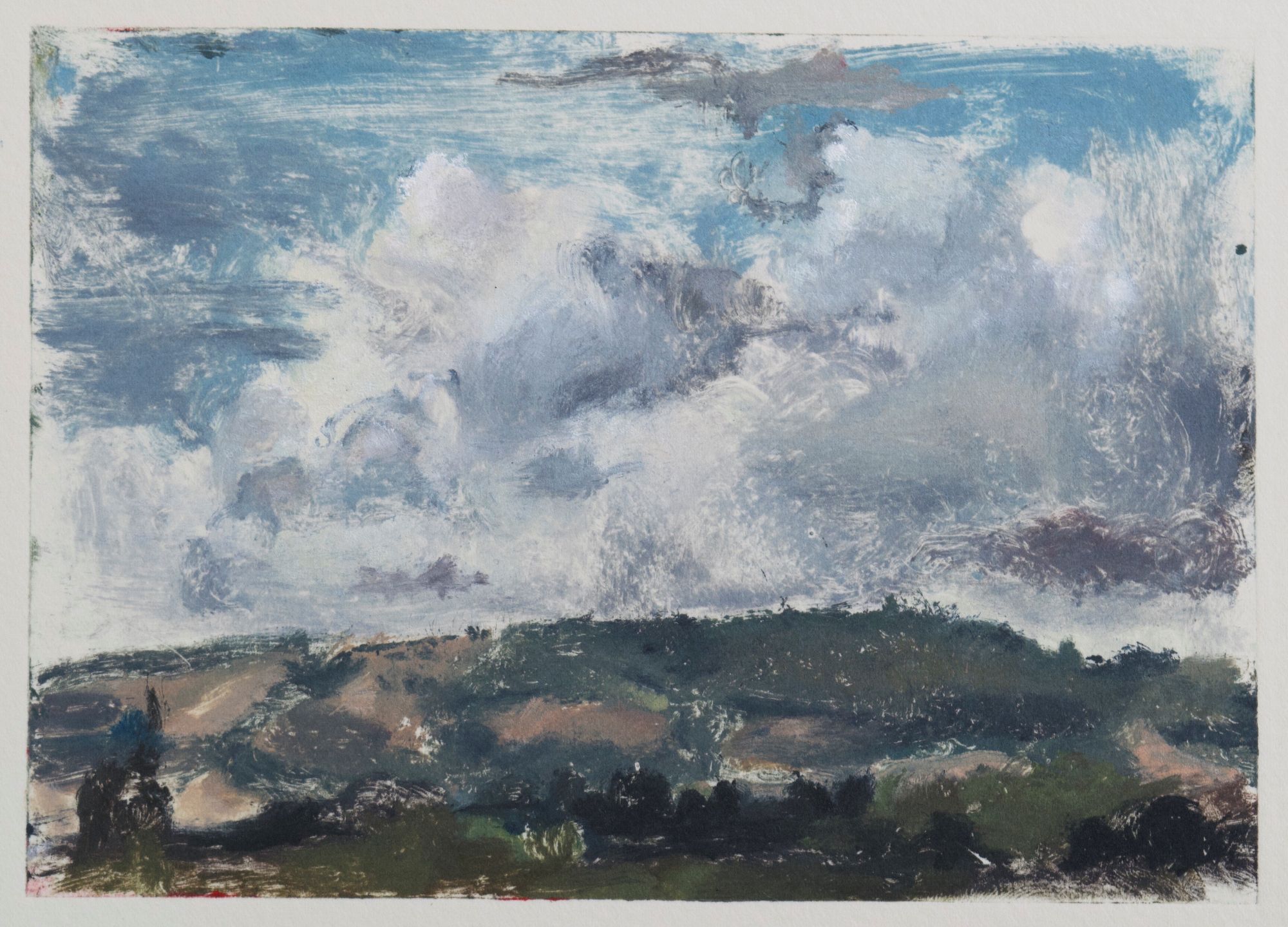
Hilltop, monotype, 10 x 14.5cm
I choose a subject using a view finder (a battered piece of cardboard with a window cut into it, replicating the proportions of my monotype plates) and I move it across the landscape until I come upon something that seems to have a distinct identity of form and shape, something which seems to express the feeling of being in nature under a particular light. Then I squint out at the landscape in an attempt to see beyond its complexities and conceive a simple tonal scheme. I wipe away the light areas of my composition using a rough cloth called scrim. I use cotton buds, brushes, and more ink to persuade the tone into an image.
I often find that it emerges very gradually; you have to let the process take its time and trust that eventually something recognisable will appear if you’re patient (success or failure seems to me to be intimately connected to your state of mind while you work – to be deeply absorbed while maintaining some detachment from the outcome seems ideal). Monotype is, however, also a medium which encourages economy; the ink must be worked relatively quickly, in one session. It feels like an exercise in balance – I try to develop the image everywhere just enough so as not to break its unity, and to attempt to communicate a complete idea, something not unlike that first squint-impression of the landscape.
All of the most powerful images seem to me to possess an underlying balance: the sense that every form is necessary to the whole. If I turn to Gwen John for example, or to Morandi – both of whom I love, and whose compositions possess a beautiful clarity – I feel that their work succeeds so well in this respect as to leave something like an afterimage or an impression in your mind’s eye, so that you almost need not look for very long (though you want to). It is part of their magic, which transforms the things of our everyday experience.
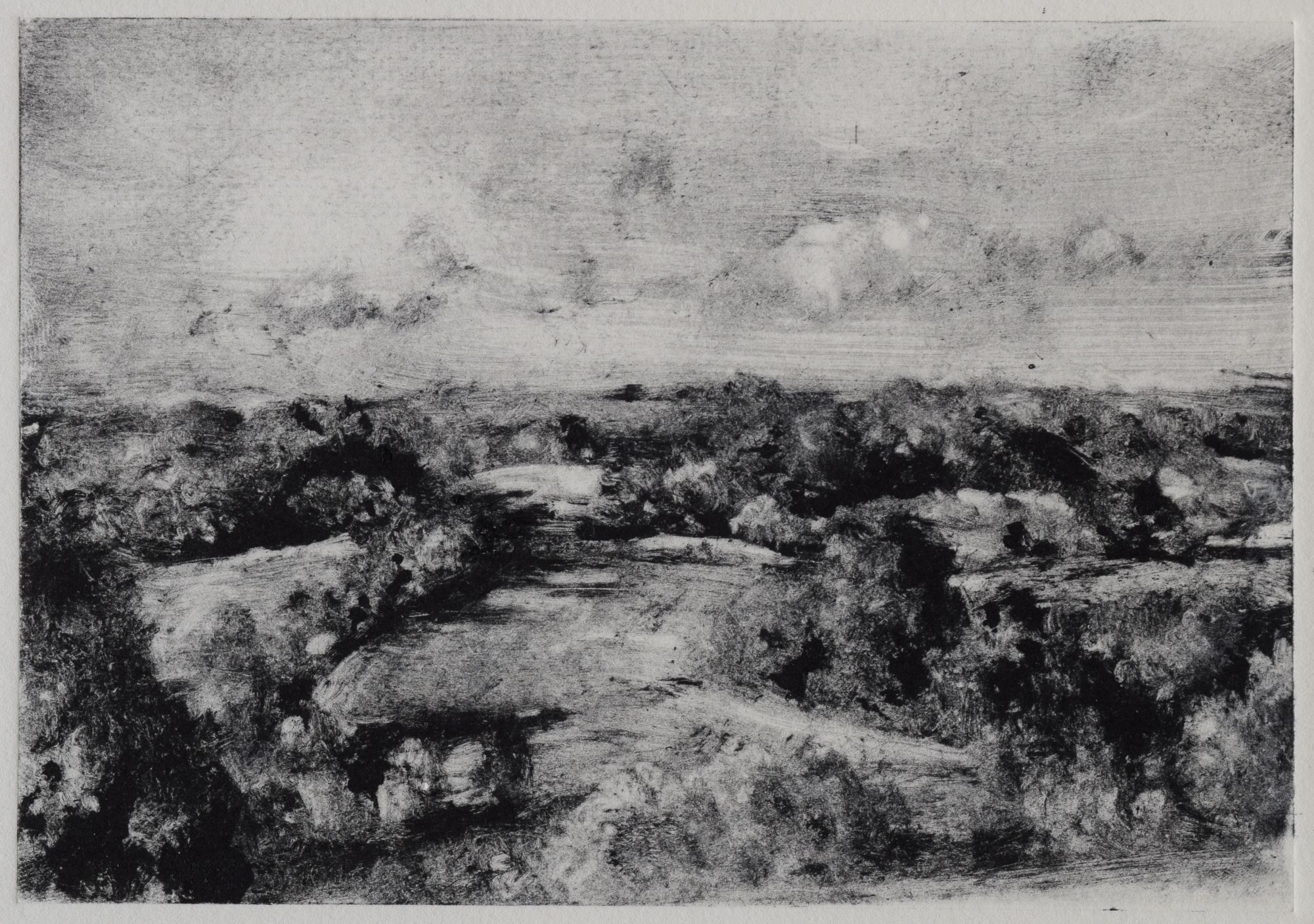
View from the village, monotype 14.5 x 20cm
I’m often drawn to images that seem to say just enough to allow for viewer’s imaginative participation in the work. I am thinking now of the wanly lit interiors of Sickert’s Camden Town paintings. Though I’ve never been in a room resembling the ones he paints (which are, after all, rather threatening), there is something about their selectiveness that allows them a universal quality – they seem to evoke something from my own experience (perhaps merely of watching the way that light moves through a room).
Monotype, because it encourages selectiveness (in its time-limited nature, and in the way it requires the decisive division of light from dark), seems to assist the discovery of what is essential to an image.
The only kind of work that comes naturally to me personally is the sort that is driven by ideas that are intimately connected to, and assisted by, the process of making. They’re often visual rather than verbal ideas; it is sometimes difficult to describe them interestingly in words. When Virginia Woolf wrote about Sickert, she described painting as a ‘silent land’¹ – walking around the National Gallery recently, I felt that many of the paintings possess this mysterious sense of silence, which perhaps is partly due to their being literally soundless whilst having extraordinary visual presence – a result of the intensity with which the artists have given themselves over to the wordless problems of colour, form and light. The silence of these paintings seems to me to be part of their inexhaustible power – some have specific narrative or religious intentions which may be more obscure to us than to their original audience, but their power as paintings remains intact.
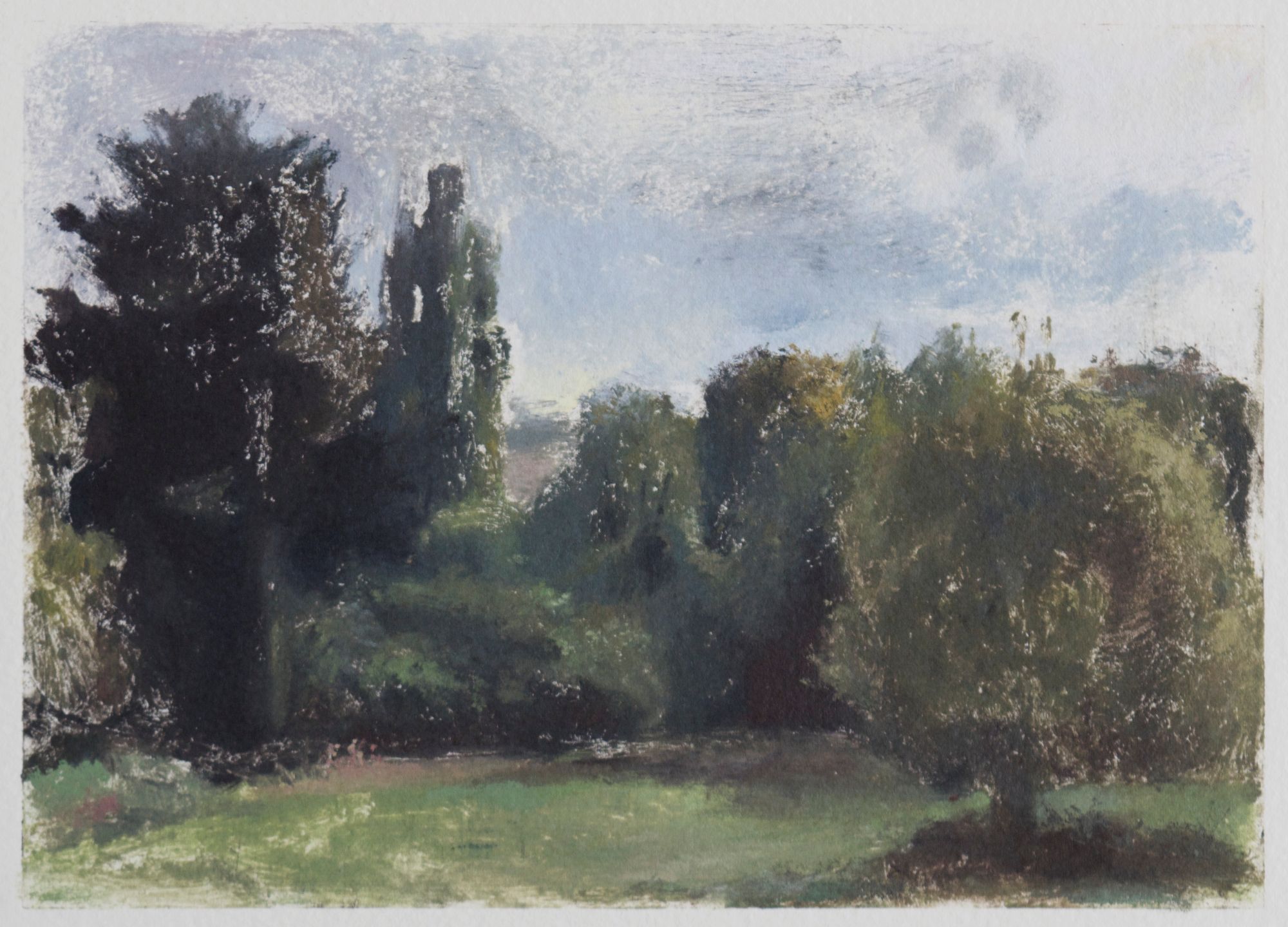
The field on a grey day, monotype, 14.5 x 20cm
When I have finished working on my plate I seal it carefully inside a Tupperware box, and walk home to my press. I soak my paper and blot it again, so that it is slightly damp to the touch.
The press is temperamental, and every twentieth print or so (around the time when I come to the tentative conclusion that it is fixed) it performs a last-minute annihilation of my work by chewing the paper up into a ball. I try not to get too frustrated when this sort of thing happens; learning to make images often seems to me to involve suspending your desire to achieve something to an (ever-retreating) future occasion, while trying to remain hopeful that you will occasionally be rewarded with a beautiful image (though I’ve sometimes found myself gazing despairingly at the crumpled paper for a good few minutes, wondering what it would’ve looked like).
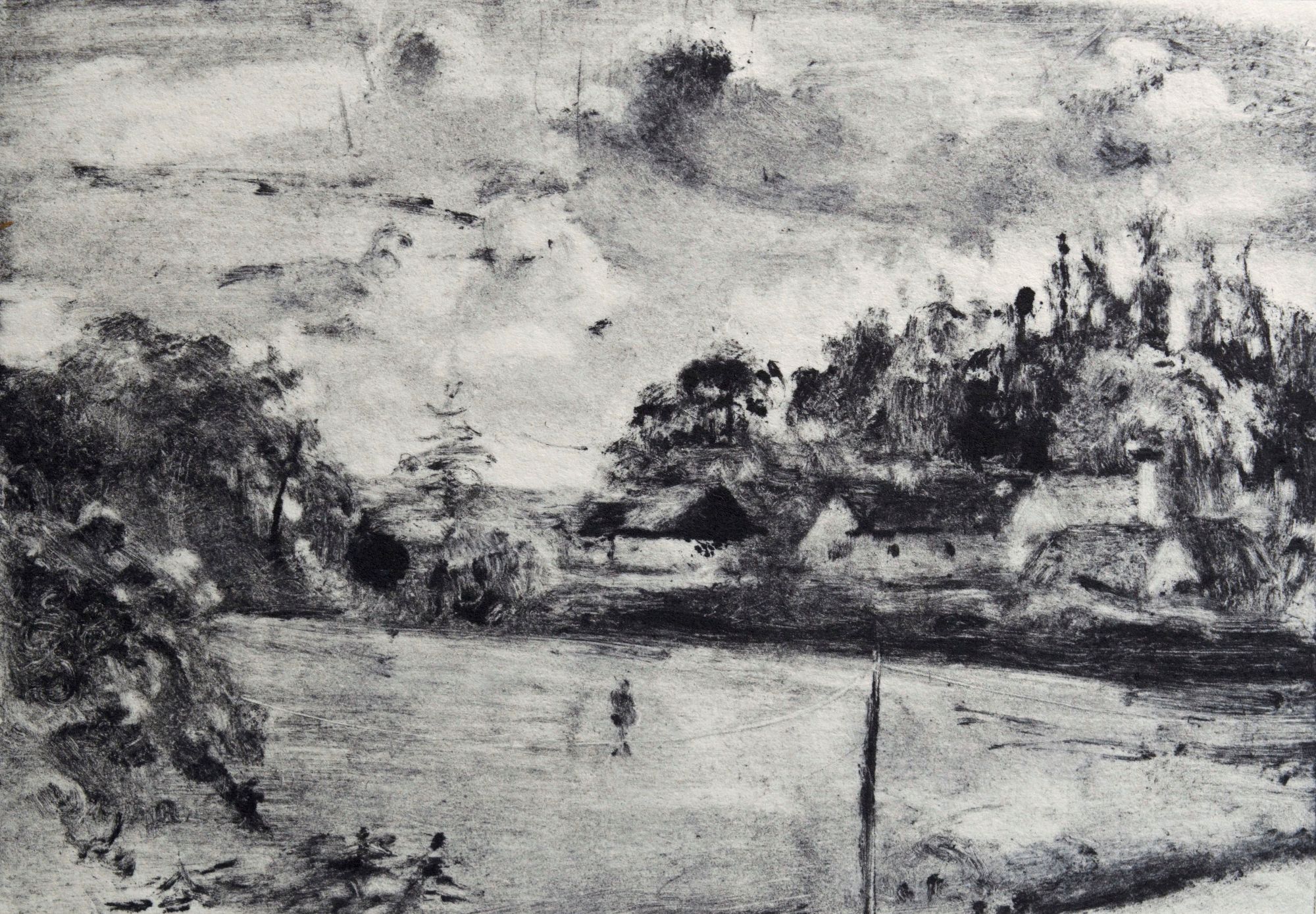
Landscape with houses and figure, Monotype, 10 x 14.5 cm
On other occasions it goes well – good images come rarely, but it’s a delight when they do. I always pause for a moment before I place the plate under paper, and run it slowly through the press. There’s usually something unexpected in the print, and I often have to wait a few days before I can decide whether or not I am pleased – sometimes an image I’ve been disappointed with at first turns out to be a favourite, and vice versa. I’ve decided to make it part of my practice to now and then learn new processes, in the hope of bringing fresh life to the way I make images; recently I’ve begun to make monotypes with coloured inks, and feel that these have brought me closer to understanding how I want to paint in the landscape.
Find out more about Katherine Jackson on her NEAC artist profile, where you will also find a selection of her artworks, including monotypes, available to purchase online.
